September 15, 2022
How to Write an Outstanding Resume
Viki Johnson
Article, Resume
I’ve taken out some time to collect my thoughts about how to best present what I’ve found over time to be the ingredients for a good resume, and I was able to group them into 5 basic highlights:
Ready to Write Your Banger Resume?
One question I get a lot from friends, and generally young Nigerians who are fresh out of university is: “How do I write a resume?”
I used to think that the answer was quite obvious, but when I look back at writing my first-ever resume, I understand how difficult it can be to pitch yourself on paper. And, as Ali Abdaal, my favorite productivity YouTuber once said, “Things only seem obvious to you because you know how to do them.”
Fast forward a couple of years after I wrote, and aggressively submitted my first resume for various job applications, I am utterly embarrassed to say that that scanty piece of a document was my handiwork. Now, I work a remote job that requires me to perform some Human Resources responsibilities, so I do come by a lot of applications and as such, have been able to pick up a few tips to help with resume writing. Many of these tips, I’ve shared with friends, and from the feedback I gather, they’ve been quite helpful. So why not write a blog post about it? Enough with the two-paragraph intro, let’s dive right in.


What Makes a Good Resume?
I’ve taken out some time to collect my thoughts about how to best present what I’ve found over time to be the ingredients for a good resume, and I was able to group them into 5 basic highlights:
- Content
- Clarity
- Conciseness
- Appearance & Readability
- Document Presentation
Content
The most important content on your resume (or CV) is your relevant work experience. Emphasis on “relevant”. If some experience is not relevant to the job you’re applying for, then it should not be highlighted. If you must include it, then make it the last on the list. When highlighting your work experiences, do so in bold headings, stating the job title, company/organization, and job duration. Also, include a bullet-point list summarizing your responsibilities and achievements at each job/experience. Start from your most recent experience and work your way backward.
If you’re a fresh graduate, you’re probably already thinking “But I don’t have work experience na?” Baby girl/boy, you do. Your experience as a class representative, or some association executive in school, or even that business you started out that did not work out (sha don’t claim CEO in your resume oh). Your SIWES/IT experience, final year project, working at a cyber cafe that year, your occupation/internship during the COVID19 break… it all counts as work experience. We often overlook our experiences when it comes to writing a resume, it happens to everyone. But here’s the thing: YOUR RESUME IS NOT A PLACE TO BE HUMBLE OR MODEST. Show yourself!
Other contents you should include in your resume are; your contact information (phone number, email, don’t include your address please), a summary of your experiences, and academic qualifications (Not your primary and secondary school though. — Employers usually don’t care about that). If you’re still studying for a diploma or a degree, then state your course of study and expected year of graduation. Also state any non-academic certifications you have earned, list your skillet, and include relevant links (e.g a link to your portfolio, if you have one).
Another important thing is to tailor the content of your resume to suite the job you’re applying for. If you’re applying for multiple jobs at the same time (which is a wise thing to do), then write a separate resume for each job. Each one showcasing your strengths in areas that matter specifically to that employer.
Clarity
Make your resume as clear as possible. Avoid all forms of ambiguity, and do not give the reader a reason to make an assumption, or try to figure something out themselves because it isn’t clearly stated in the document. A perfect example of what NOT to do is to start your resume with a “Media Specialist” heading, for example, and then end it with “I am a veterinary doctor who loves animals very much.” This is highly ambiguous, and while I do encourage that you show some diversity and try to capture as much of what you do as possible, it is important to explain further, so as to give more clarity.
So let’s assume the writer of this resume is a Vet doctor by qualification, who recently just started a one-man Media business and is looking to gain some experience by working a related job. A better way to put this would be to state it in the introduction. For example “I am a veterinary doctor who is looking to for an entry into the media industry. I currently have some related skills, and would love to go professional.” This makes a HUGE difference.
Also, don’t try to use the biggest words you can find. Use simple words.
Conciseness
This, simply put, is giving as much necessary information in as few words as possible. Avoid being unnecessarily verbose by summarizing your message into simple sentences. Whoever’s reading your resume has a ton of other resumes to go through, and will probably not spend up to 5 minutes on yours. So you want to make sure you’re getting as much info as you can into simple, short, and straight-to-the-point sentences. For example, instead of saying “I am an individual who is adept in the use of multimedia equipment such as cameras, film projectors, slides, and recording equipment, on behalf of an institution.” Just say “I am a media specialist.”
Appearance and Readability
Many people pay very little attention to how their resume looks at first glance. While the content is most important, appearance does in many cases, determine whether or not the document will even be read at all. Now I’m not saying go into “graphic designer” mode and come up with a killer design or anything, but you want to make sure that your content is formatted in an orderly manner, that is inviting to the eyes. At first glance, you want the reader to think “Okay, this is something that will be easy to read.” Here are some tips to follow.
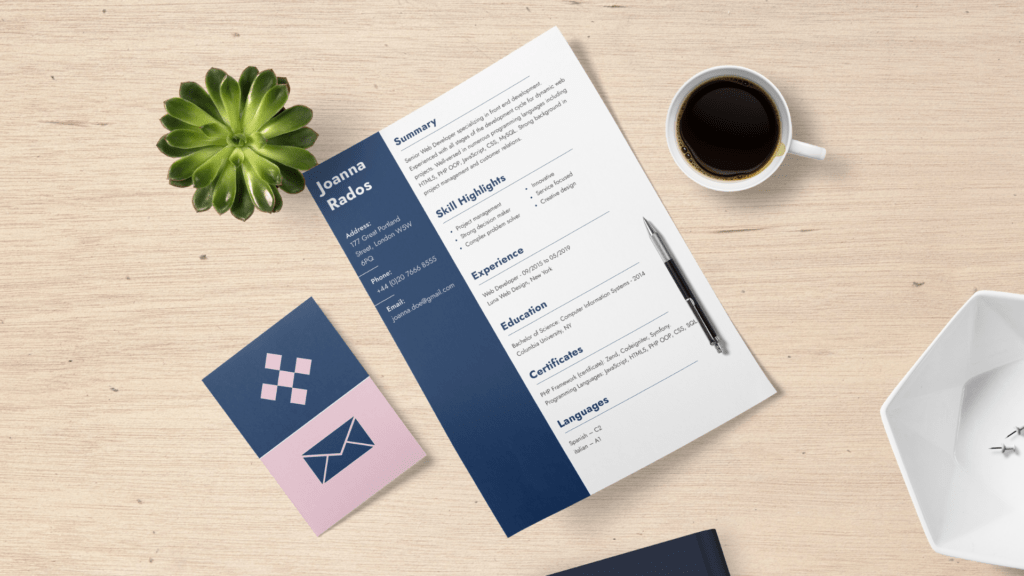
- Divide your resume into sections — preferably, two columns containing a couple of rows each. The first, more narrow column can contain a summary of yourself, a list of your skills, and contact information. The second, wider column will contain your experiences, qualifications, certifications, e.t.c This isn’t a hard-and-fast rule, but I discovered that this format makes the document look very clean and easy to read.
- Space out your paragraphs and sections. Avoid large clusters of text by putting one row of empty space between each paragraph, and maybe one or two rows between each section. Also, allow a decent amount of space between columns.
- Use simple, readable fonts, and not more than 2 – 3 different fonts. Avoid cursive or fancy fonts altogether, unless you have a very intentional use for them in your resume.
- Font sizes should be legible, and not too large either. Your headings should be a bit larger and bolder than other texts.
- Double and triple-check for typographical errors. I use a tool called Grammarly for spelling and grammar checks whenever I write. You can check it out.
- Have some kind of color variation for different types of information: If you’re going for black and white, then you can consider using a grey shade for headings or off-white background for the second column, just to give a more visually appealing look. This is completely optional, like I said, there’s no hard-and-fast rule to it. If you decide to go for a more rich colour scheme, then make sure that you use very few colors (not more than 2 excluding black and white) and that your primary background is white. Also, make sure that the colours match, and that they do not make your resume look too playful. i.e, avoid a rainbow-themed resume. Lol
- Including a photograph of yourself in your resume could also be a big plus. Make sure your photograph is not busy though, preferably with a plain white background. Appear corporate in your photograph and make sure it does not exceed your head and torso. This is not a photoshoot. lol
Document Presentation
Your resume can be presented as a physical document or electronically, as a soft document, depending on what your potential employer has requested or made provision for. A4 paper size is more appropriate for printed CVs. These days, most employers require you to submit an electronic resume. Make sure you use the right file format requested. If there isn’t a file format stated in the job ad, then a pdf will be appropriate.
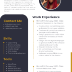
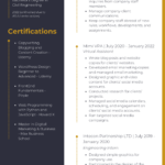
Here’s an example of a modern resume that is guaranteed to GET READ. Click on the images above to view. You can create a clean and organized resume like this for free using Canva templates. If you want to “burst brains” however, you can create a website resume for yourself for free using Carrd or Notion.
Long story short, make your resume easy to read and understand, go straight to the point, highlight your strengths, and show off your skills and accomplishments. Usually, one or two A4-sized pages will do. Try not to exceed four pages if you two are too few to accommodate your awesomeness. Remember this: a great resume will get you an interview, but it does not guarantee that you will get the job. So prepare for the interview very thoroughly as well. Being good at what you do is the only guarantee for getting and sustaining a good job (unless your dad is the Director sha).
Let me know your thoughts in the comments. Feel free to ask me questions if you have any as well, and if you found this post useful, kindly share it with a friend or two.
Post Tags :
Article, Resume

